Plots can be many types:
Customization and annotation of graphs is possible.
#Keywords: col, h, lty, pch, bg, fg, ann,type, par
par is used to set or query graphical parameters
ann is default annotation
#Colors: green, blue, gray
require(datasets)
require(grDevices); require(graphics)
----------------------------------------------------------
Following snippets are modified form of codes from
https://stat.ethz.ch/R-manual/R-devel/library/graphics/demo/graphics.R
#Plots random numbers
x <- stats::rnorm(100)
opar <- par(bg = "white")
plot(x, ann = FALSE, type = "n")
abline(h = 0, col = gray(.90))
lines(x, col = "green4", lty = "dotted")
points(x, bg = "green", pch = 21)
title(main = "Plotting",
xlab = "Labelling",
col.main = "red", col.lab = yellow(.8),
cex.main = 1.2, cex.lab = 1.0, font.main = 4, font.lab = 3)

#Plots graph using the dataset package e.g mtcar
require(datasets)
require(graphics)
pairs(mtcars, main = "mtcars data")
coplot(mpg ~ disp | as.factor(cyl), data = mtcars,
panel = panel.smooth, rows = 1)
 #Plots a pie chart
par(bg = "yellow")
pie(rep(1,12), col = rainbow(12), radius = 0.8)
title(main = "Spectrum", cex.main = 1.2, font.main = 4)
title(xlab = "(Raincow colors)",
cex.lab = 0.8, font.lab = 3)

#Plots a pie chart . The pie used here is a function
cake.bake <- c(0.17, 0.37, 0.26, 0.18, 0.2, 0.12)
names(cake.bake) <- c("Orange", "Apple",
"Grapes", "Raspberry", "Coconut","Other")
pie(cake.bake,
col = c("orange","yellow","limegreen","red","white","pink"))
title(main = "Favorite cake bake", cex.main = 1.8, font.main = 1)
title(xlab = "(varieties)", cex.lab = 1, font.lab = 3)
 #Creates box plot
par(bg="white")
n <- 15
g <- gl(n, 100, n*100)
x <- rnorm(n*100) + sqrt(as.numeric(g))
boxplot(split(x,g), col="pink", notch=FALSE)
title(main="Box plots", xlab="Clustered", font.main=3, font.lab=1)
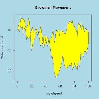
 #Graphs the area between time-distance plot
par(bg="lightblue")
n <- 100
x <- c(0,cumsum(rnorm(n)))
y <- c(0,cumsum(rnorm(n)))
xx <- c(0:n, n:0)
yy <- c(x, rev(y))
plot(xx, yy, type="n", xlab="Time elapsed", ylab="Distance covered")
polygon(xx, yy, col="yellow")
title("Brownian Movement")
#Trend plot
x <- c(0.5, 0.7, 1.3, 2.6, 3.1, 4.6, 4.9, 5.2, 5.6)
par(bg="pink")
plot(x, type="n", axes=FALSE, ann=FALSE)
usr <- par("usr")
rect(usr[1], usr[3], usr[2], usr[4], col="yellow", border="magenta")
lines(x, col="red")
points(x, pch=21, bg="orange", cex=1.5)
axis(2, col.axis="blue", las=1)
axis(1, at=1:12, lab=month.abb, col.axis="blue")
box()
title(main= "Population boom", font.main=4, col.main="red")
title(xlab= "2015", col.lab="red")


pairs(iris[1:4], main=" Iris flower data", pch=21,
bg = c("red", "green3", "blue")[unclass(iris$Species)])

#Conditioning plot (quakes data)
par(bg="pink")
coplot(lat ~ long | depth, data = quakes, pch = 21, bg = "pur")
par(opar)

#Contour or topography plot (volcano data)
x <- 10*1:nrow(volcano)
y <- 10*1:ncol(volcano)
lev <- pretty(range(volcano), 10)
par(bg = "white")
pin <- par("pin")
xdelta <- diff(range(x))
ydelta <- diff(range(y))
xscale <- pin[1]/xdelta
yscale <- pin[2]/ydelta
scale <- min(xscale, yscale)
xadd <- 0.5*(pin[1]/scale - xdelta)
yadd <- 0.5*(pin[2]/scale - ydelta)
plot(numeric(0), numeric(0),
xlim = range(x)+c(-1,1)*xadd, ylim = range(y)+c(-1,1)*yadd,
type = "n", ann = FALSE)
usr <- par("usr")
rect(usr[1], usr[3], usr[2], usr[4], col="yellow")
contour(x, y, volcano, levels = lev, col="red", lty="solid", add=TRUE)
box()
title("A Topographic Map", font= 4)
title(xlab = "Meters North", ylab = "Meters West", font= 3)
mtext("10 Meter Contour Spacing", side=3, line=0.35, outer=FALSE,
at = mean(par("usr")[1:2]), cex=0.7, font=3)

Density plots (histograms and kernel density plots), dot plots, bar charts (simple, stacked, grouped), line charts, pie charts (simple, annotated, 3D), boxplots (simple, notched, violin plots, bagplots) and scatter plots (simple, with fit lines, scatterplot matrices, high density plots, and 3D plots).
The Advanced Graphs section describes how to customize and annotate graphs, and covers more statistically complex types of graphs.Customization and annotation of graphs is possible.
#Keywords: col, h, lty, pch, bg, fg, ann,type, par
par is used to set or query graphical parameters
ann is default annotation
#Colors: green, blue, gray
require(datasets)
require(grDevices); require(graphics)
----------------------------------------------------------
Following snippets are modified form of codes from
https://stat.ethz.ch/R-manual/R-devel/library/graphics/demo/graphics.R
#Plots random numbers
x <- stats::rnorm(100)
opar <- par(bg = "white")
plot(x, ann = FALSE, type = "n")
abline(h = 0, col = gray(.90))
lines(x, col = "green4", lty = "dotted")
points(x, bg = "green", pch = 21)
title(main = "Plotting",
xlab = "Labelling",
col.main = "red", col.lab = yellow(.8),
cex.main = 1.2, cex.lab = 1.0, font.main = 4, font.lab = 3)

#Plots graph using the dataset package e.g mtcar
require(datasets)
require(graphics)
pairs(mtcars, main = "mtcars data")
coplot(mpg ~ disp | as.factor(cyl), data = mtcars,
panel = panel.smooth, rows = 1)

par(bg = "yellow")
pie(rep(1,12), col = rainbow(12), radius = 0.8)
title(main = "Spectrum", cex.main = 1.2, font.main = 4)
title(xlab = "(Raincow colors)",
cex.lab = 0.8, font.lab = 3)

#Plots a pie chart . The pie used here is a function
cake.bake <- c(0.17, 0.37, 0.26, 0.18, 0.2, 0.12)
names(cake.bake) <- c("Orange", "Apple",
"Grapes", "Raspberry", "Coconut","Other")
pie(cake.bake,
col = c("orange","yellow","limegreen","red","white","pink"))
title(main = "Favorite cake bake", cex.main = 1.8, font.main = 1)
title(xlab = "(varieties)", cex.lab = 1, font.lab = 3)

par(bg="white")
n <- 15
g <- gl(n, 100, n*100)
x <- rnorm(n*100) + sqrt(as.numeric(g))
boxplot(split(x,g), col="pink", notch=FALSE)
title(main="Box plots", xlab="Clustered", font.main=3, font.lab=1)

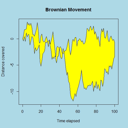
par(bg="lightblue")
n <- 100
x <- c(0,cumsum(rnorm(n)))
y <- c(0,cumsum(rnorm(n)))
xx <- c(0:n, n:0)
yy <- c(x, rev(y))
plot(xx, yy, type="n", xlab="Time elapsed", ylab="Distance covered")
polygon(xx, yy, col="yellow")
title("Brownian Movement")
#Trend plot
x <- c(0.5, 0.7, 1.3, 2.6, 3.1, 4.6, 4.9, 5.2, 5.6)
par(bg="pink")
plot(x, type="n", axes=FALSE, ann=FALSE)
usr <- par("usr")
rect(usr[1], usr[3], usr[2], usr[4], col="yellow", border="magenta")
lines(x, col="red")
points(x, pch=21, bg="orange", cex=1.5)
axis(2, col.axis="blue", las=1)
axis(1, at=1:12, lab=month.abb, col.axis="blue")
box()
title(main= "Population boom", font.main=4, col.main="red")
title(xlab= "2015", col.lab="red")

#Graphs the area between histogram
par(bg="skyblue")
x <- rnorm(100)
hist(x, xlim=range(-3, 3, x), col="grey", main="")
title(main="Normal Curve", font.main=2)

#Scatter plot using a data set (here Iris data)
pairs(iris[1:4], main="Iris flower data", font.main=4, pch=19)pairs(iris[1:4], main=" Iris flower data", pch=21,
bg = c("red", "green3", "blue")[unclass(iris$Species)])

#Conditioning plot (quakes data)
par(bg="pink")
coplot(lat ~ long | depth, data = quakes, pch = 21, bg = "pur")
par(opar)

#Contour or topography plot (volcano data)
x <- 10*1:nrow(volcano)
y <- 10*1:ncol(volcano)
lev <- pretty(range(volcano), 10)
par(bg = "white")
pin <- par("pin")
xdelta <- diff(range(x))
ydelta <- diff(range(y))
xscale <- pin[1]/xdelta
yscale <- pin[2]/ydelta
scale <- min(xscale, yscale)
xadd <- 0.5*(pin[1]/scale - xdelta)
yadd <- 0.5*(pin[2]/scale - ydelta)
plot(numeric(0), numeric(0),
xlim = range(x)+c(-1,1)*xadd, ylim = range(y)+c(-1,1)*yadd,
type = "n", ann = FALSE)
usr <- par("usr")
rect(usr[1], usr[3], usr[2], usr[4], col="yellow")
contour(x, y, volcano, levels = lev, col="red", lty="solid", add=TRUE)
box()
title("A Topographic Map", font= 4)
title(xlab = "Meters North", ylab = "Meters West", font= 3)
mtext("10 Meter Contour Spacing", side=3, line=0.35, outer=FALSE,
at = mean(par("usr")[1:2]), cex=0.7, font=3)

No comments:
Post a Comment